RELATED LINKS
Blind & Visually Impaired Accessibility Checklist
This checklist of accessibility features will greatly improve access to coursework and course material for students who are blind or visually impaired.
- Blind & Visually Impaired Accessibility Checklist with images of a course site BEFORE and AFTER compliance is improved (below) or text only Blind & Visually Impaired Accessibility Checklist (PDF)
- Screen reader user videos that demonstrate WHY checklist features are important.
- Accessibility Resources page provides user guides and resources for improving checklist features described on this page.
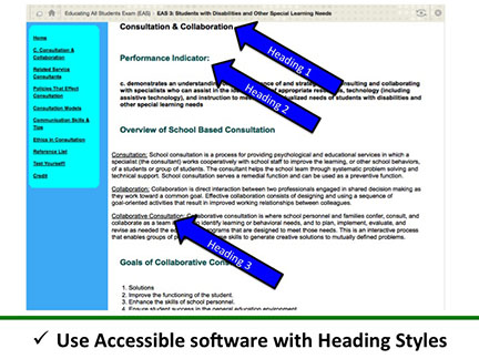
Use Accessible Software Headings Styles
Quality heading structures facilitate navigation for screen reader users. With keyboard strokes, a screen reader user can navigate to specific headings (and skip other content) when desired. Heading Styles should be listed hierarchically (Heading 1, Heading 2 to Heading 3 and so forth). Headings Styles are easily inserted into Word, Blackboard, Softchalk and other accessible software. Screen readers cannot navigate visual page elements (font, size, bold, etc.), unless coded within a Heading Style. Watch screen reader Heading Styles video demonstration >>
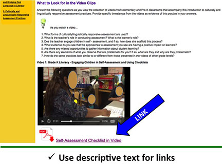
Use Descriptive Hyperlinks
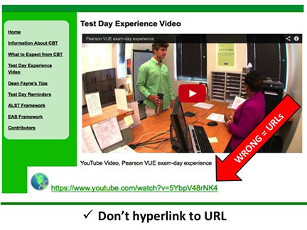
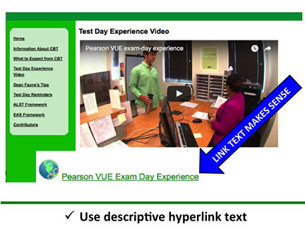
Do not hyperlink to the direct URL of a website page, which a screen reader will attempt to read as a word. Use descriptive hyperlink text that makes sense and informs all users about link content. Watch screen reader Hyperlinks video demonstration >>
| Fail |
Pass |
 |
 |
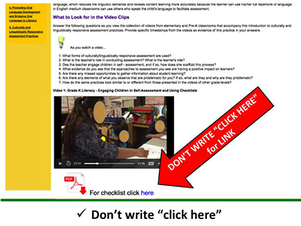
Do Not Link to the Words "Click Here"
Do not write "click here" or any other non-specific phrases when linking to websites or downloadable files. A screen reader user can navigate with keystrokes between links, so repeatedly navigating to the words, "click here" disrupts understanding and is not accessible content for a screen reader user. Screen reader demonstration video >>
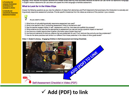
Improve Descriptive Hyperlinks with File Formats
Use descriptive text for links and indicate the file type in parenthesis. For example, at end of link to a PDF file include (PDF) in parenthesis. Some screen reader products state the word, "link" to a user, while others do not. Adding (PDF) to the description enables all users to understand that the link is downloadable and not to another webpage.
|
Fail |
Pass |
 |
 |
 |
|
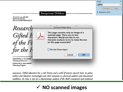
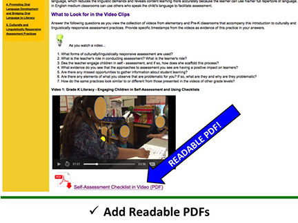
Use Readable PDFs
Make sure all PDFs are readable by a screen reader. An easy way to determine "readability" is to search for a word in the document. Scanned pages are saved as images and are not searchable or screen readable. A scanned article, book chapter, form, etc. will not be accessible to a screen reader user unless it is scanned with an OCR (optical character recognition software). Using an OCR is the only way to scan printed text and save as digital text.
|
Fail |
Pass |
 |
 |
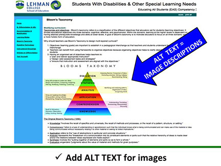
Use Alternative Text for Images
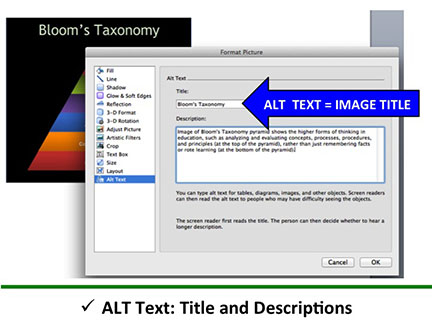
Alternative text (alt text) is descriptive text that provides meaning and information about the content in the image to a screen reader user. This text is accessible only by a screen reader (will not be seen by others) and is especially important if the content is not described in the body of the page. Watch screen reader Alternative Text video demonstration >>
 |
 |
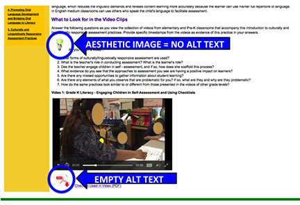
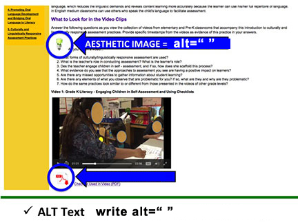
Decision Making about Alt Text (Aesthetic Image or Not)
Instructors and technologists need to consider if alternative text improves content understanding or is only a visual design feature. Aesthetic or decorative images should include alt=" " as the Alt text so the screen reader knows to ignore it. If the Alt text for the image is left blank, a screen reader will likely read the file name which is usually meaningless and confusing (i.e. IMG 34549). For best practices and information about whether an image is aesthetic or not, review specific examples created by web accessibility in mind (WebAIM
|
Fail |
Pass |
 |
 |
 |
Universal Design re: Images
Universal design* of online coursework is greatly encouraged because multiple means of representation (i.e. images, video) in addition to text based content provides alternative access and understanding for different types of learners. Therefore, we strongly encourage using purposeful images and video in online coursework. Effective use and decision making around alternative (alt text) for images and video is critical for screen reader users. [*Universal Design for Learning in Higher Education, CAST]
Fonts and Colors
- Choose simple, easy to read font (Arial, Times, Tahoma, Veranda, etc.)
- Don’t use appearance of font (color, shape, placement) as the only way to convey meaning
- Use sufficient color contrast between text and background colors
- Be aware that red and green often appear gray for people who are color blind
Screen Reader User Video Demonstrations of WHY Checklist Features are Important
 William Medina graduated from Lehman College with a Master's Degree in Accounting. William joined the School of Education on the CUNY STI Accessibility Project team and using several different screen readers, he navigated all our fully-online School of Education certification exam preparation modules. By demonstrating the experiences of a blind or visually impaired student enrolled in a fully-online course, William provided expertise that greatly improved the accessibility of our online modules.
We provide several screen reader demonstration videos below so you can listen to how a screen reader user navigates elements of a course BEFORE (Fail) and AFTER (Pass) improving the accessibility features. These video demonstrations reinforce that screen readers need coding (tags) built into documents and websites to interpret the document or site structure to best access the content. Screen reader users can navigate through the embedded tags, which must follow the visual and logical order of the content. Document and website structures include, heading styles, images, paragraphs, lists, tables, forms, etc. You do not need coding expertise to improve these features! Most software and online tools have built-in very easy ways to make these basic accessibility improvements.
Heading Styles
BEFORE: No Heading Styles and Incorrect Hyperlinks (detailed below).
This version of the course used blue bold text to differentiate sections, but without inserting the text using the Heading Styles, William needed to “read” the full page and could not navigate to specific sections.
AFTER: Correct Heading Styles and Reading Selected Section
William was directed to find a sub-section of this site. He used the Heading Styles to first navigate to the correct part of the page. He often used the Heading Styles as a table of contents to determine first what was available overall. You will notice that navigating via Heading Styles he skipped text and other links to get to specific content.
Hyperlinks
BEFORE: Incorrect Hyperlinks using "Click Here" and URLs
AFTER: Using Descriptive Hyperlinks to Navigate to Relevant Content
Alternative Text
BEFORE: No images on the page
AFTER: Images with Alternative Text


